DesiHeart - Express AI: An AI-powered augmentative & alternative communications (AAC) app to support neurodiverse users in expressing tone & emotion
Designing clear, user-centric, accessibility focused look for a complex product.
Team
1 CEO
1 Design Lead
6 Designers
Role
UX Researcher
UX/UI Designer
Challenge
Design an AI-powered AAC app that not only enables communication, but also brings in accessibility, emotional expression, and personalization, helping users share their voices with authenticity and confidence.
Solution
Through competitive analysis, we identified a gap in the AAC market. In response, we designed ExpressAI, an AI-powered AAC app that is affordable, easy to navigate, and accessible, enabling non-verbal users to express not only words, but emotion and personality with confidence.
DesiHeart is a nonprofit supporting neurodiverse students in developing emotional expression, communication, and confidence.
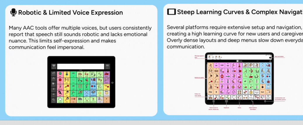
Many rely on augmentative and alternative communication (AAC) devices that are expensive, hard to learn, and limited in voice and personalization.
Context
Access: Costly AAC tools exclude the families who need them most
Time: Steep learning curves waste critical developmental time
Humanity: Robotic voices reduce communication to commands, not self-expression
Why it mattered
Finding the gaps in the market
Synthesizing competitive analysis and real user feedback revealed clear gaps in the AAC market. These findings directly shaped ExpressAI’s design strategy, prioritizing simplicity, accessibility, and emotional expression.
Why: Early clarity on user pain points guided our designs toward removing barriers, not reinforcing them
Defining the MVP vocabulary & User flow
Built a vocabulary system that prioritizes speed, learnability, and expression by:
Centering high-frequency core words
Using clear, predictable categories
Balancing power words with personalization
Allowing room to grow as skills develop
Result: Faster communication with a foundation for long-term language growth
MVP Vocab Flow
Why: Vocabulary organization directly affects learnability, speed, and user confidence
User Flow: Communication needs to be fast, predictable, and low-effort, especially for new AAC users
Reduced the number of steps required to say something meaningful
Prioritized a clear “home base” so users always know where they are
Designed predictable navigation patterns to support motor planning
Minimized decision points to lower cognitive load
Result: A simple, predictable user flow that enables faster communication and easier learning for new users
Say ‘Bathroom’ User Flow
Why: Simplifying the flow was critical to making the MVP usable from day one
Designing the MVP structure
Built a clear, scalable foundation for the MVP by focusing on structure over polish
Defined a single, predictable home base for communication
Established clear hierarchy between core actions and secondary paths
Reduced branching to keep flows easy to learn and repeat
Designed layouts that support consistency across screens
Result: A structured MVP that feels simple to use today and flexible enough to evolve with user needs
Typography, icons, components, color palette
*minimum 20px body text for readability on tablets
*Icons adhere to accessible touch targets (≥ 44px), maintain consistent stroke weight, and use color only to indicate urgency or critical action
*tap targets meet WCAG 2.5.5
*FITZ AAC Key used to reinforce syntax learning through consistent visual cues
Why: A strong foundation was essential to validate the MVP with real users
From sketches to prototypes
Home Screen Evolution
Why: The original home screen created unnecessary navigation friction and increased error risk for users with limited motor control.
Changes:
Standardized UI components
Introduced persistent side navigation for core actions
Optimized icon placement and tap targets.
Result: Improved navigation efficiency, reduced cognitive load, and enabled more accurate, motor-efficient interactions.
Why: Establishing a reliable, accessible home screen was critical before validating the MVP with users
Add a New Word — Flow Iteration
Why: Caregivers needed a clearer, more predictable way to add vocabulary without hesitation or confusion.
Changes:
Simplified the step-by-step flow
Aligned interactions to the design system
Added guidance cues
Improved accessibility through larger tap targets and reduced scrolling
Result: Created a faster, more confident workflow for caregivers, especially in time-sensitive or high-cognitive-load situations.
Add A New Word Flow
Why: Adding vocabulary is a high-frequency, high-impact task that must feel fast, predictable, and error-free for caregivers
Usability Testing (MVP Validation)
Final Screens I Owned
Why: Adding vocabulary is a high-frequency, high-impact task that must feel fast, predictable, and error-free for caregivers
The Aftermath
What we delivered:
Launch-ready MVP completed in ~3 months
Lightweight design system to support consistency and scale
Developer-ready Figma files using Auto Layout and shared components
Clear handoff documentation to reduce ambiguity and accelerate build
Reduced UX debt before engineering investment
What was planned next:
A second round of usability testing on the built MVP
Validation of real-world usage and edge cases
Iteration informed by live user behavior
Why: Before expanding functionality, it was critical to validate that users could navigate the MVP vocabulary and core flows confidently without instruction.
What we tested:
Vocabulary discoverability and category comprehension
Ability to complete core tasks without hesitation
Early signals of cognitive or motor friction
Results: Initial testing confirmed the vocabulary structure and user flow supported fast, learnable communication, establishing a solid foundation for the MVP.
This phase focused on directional validation. Future testing will expand to:
Larger and more diverse user groups
Longitudinal usage patterns
Quantitative success metrics across real-world contexts
Why it mattered: Testing ensured the MVP was usable and learnable before scaling or committing engineering effort.
“This is absolutely fabulous, I love it”
Final UI Execution & System Alignment
Why: As the product moved toward build, it was critical to ensure the UI could scale consistently across screens and designers without introducing visual or interaction drift.
What I owned:
I owned and refined key screens across the core experience, including:
Home page
Add a new word screens
Sign up screen
How it was built:
Built layouts using Auto Layout to support responsive behavior and faster iteration
Leveraged shared components to maintain consistent hierarchy, spacing, and interaction patterns
Designed within the design system to ensure cross-screen predictability
Result: A cohesive, scalable UI that supported faster iteration, smoother collaboration, and a more reliable path to development.
“The interface is looking good, it’s more engaging”
Other Work
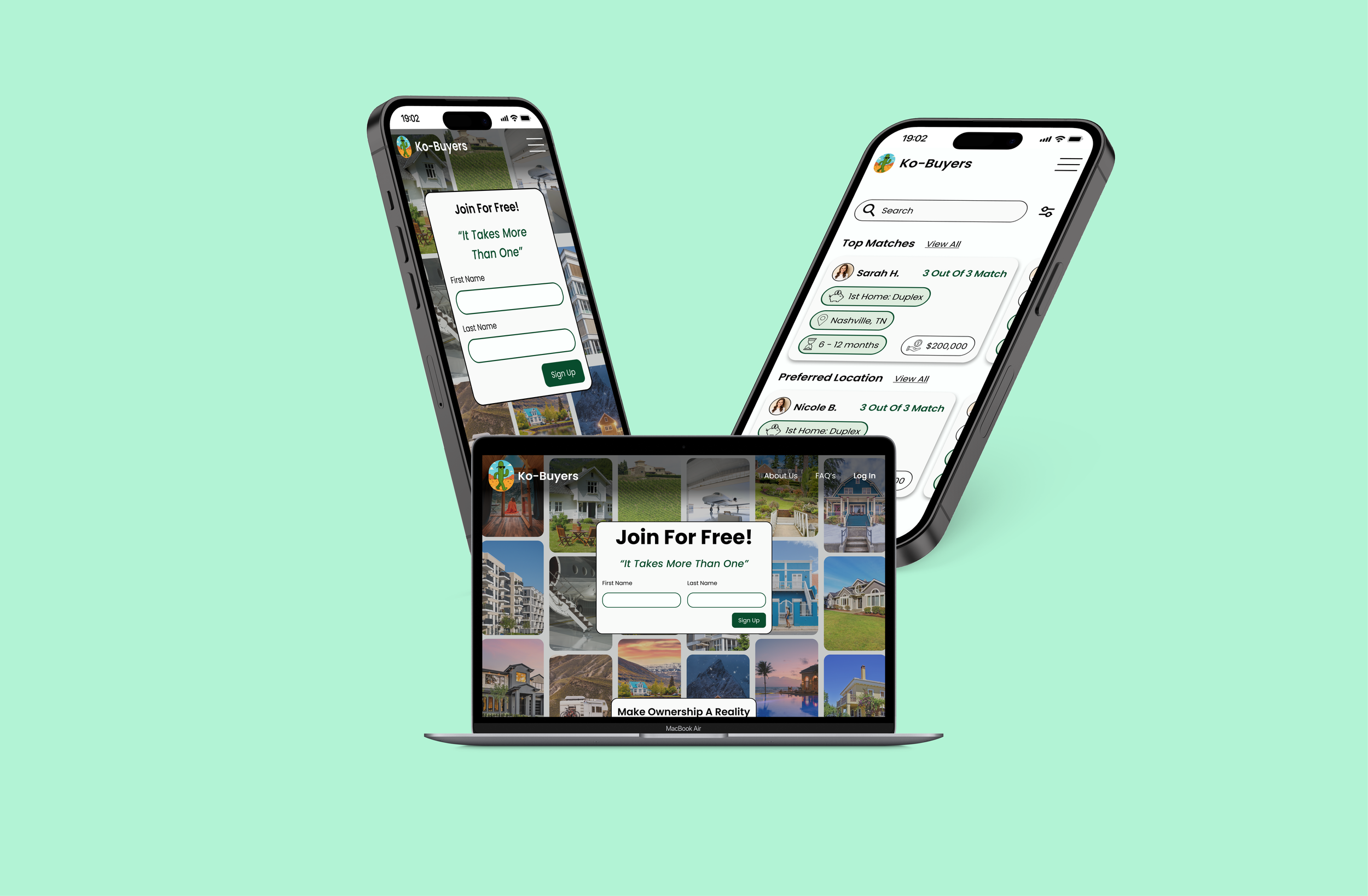
Co-Buyers
Reducing friction in co-buying at Co-Buyers for real-world homeownership.
Air Health
Designing an AI-powered wellness app from 0-1, that adapts to users and supports sustainable habit building.