
Texas Employers For Affordable Healthcare
Creating a cleaner, more inviting landing page to increase memberships for a non-profit organization.
Original Design
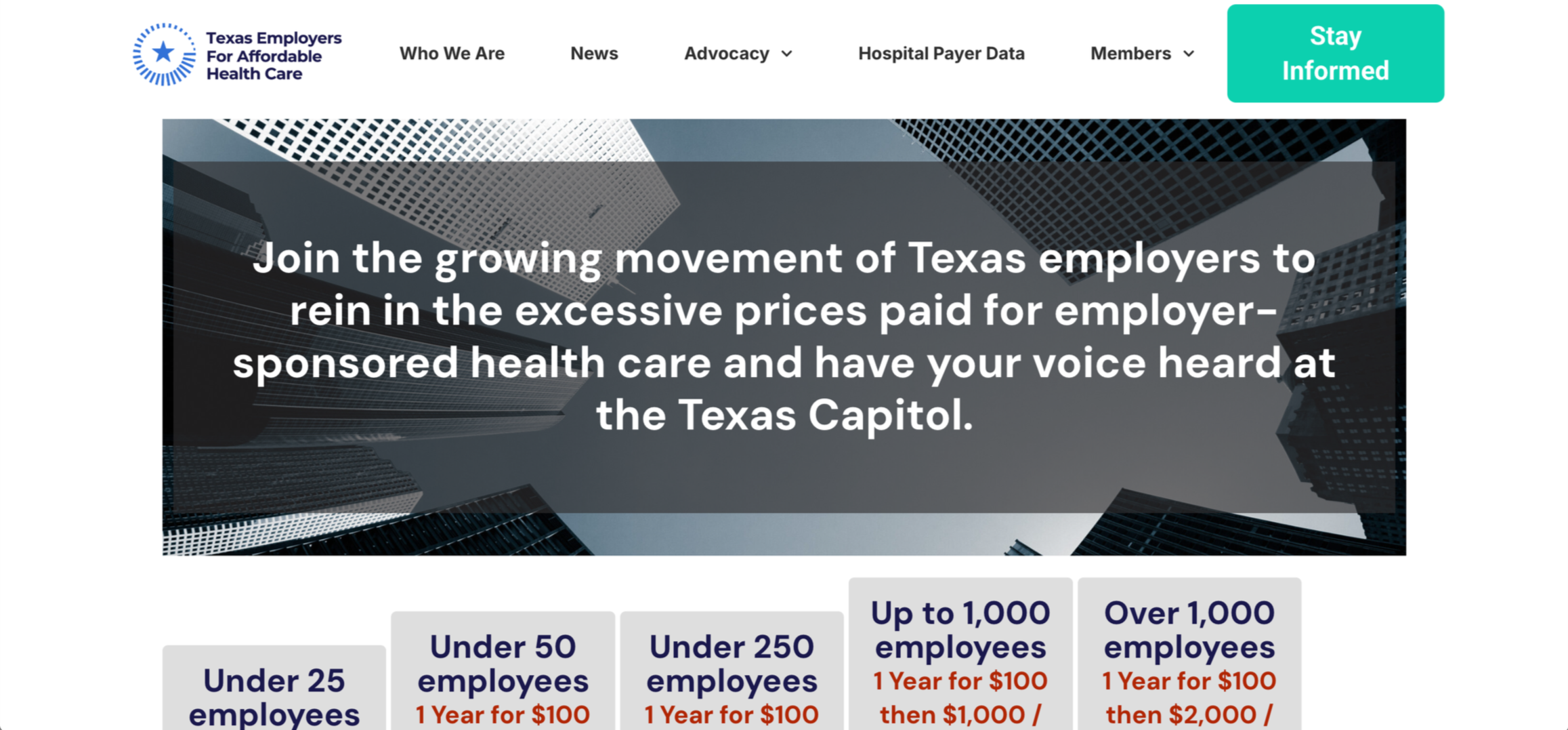

Challenge
The original landing page lacked engaging content and clear design, resulting in low user engagement and minimal membership sign-ups.
Solution
Redesigned the landing page with a clearer structure and user-focused content, providing the information visitors were seeking and creating a more engaging experience that drives higher membership sign-ups.
Role
UX/UI Designer
Tools
Figma, wordpress
Content Strategy
One of the biggest challenges with the original landing page was the lack of content and unclear messaging. As part of the redesign, the organization provided me with a document containing updated copy, and I focused on structuring it in a way that was clear, engaging, and easy to navigate.
To do this, I applied design heuristics and UX best practices to determine the information hierarchy and overall layout. I prioritized the most critical messaging at the top of the page, grouped related content into scannable sections, and used headings, subheadings, and visuals to guide users’ attention. The goal was to make it effortless for visitors to understand the nonprofit’s mission, explore membership benefits, and take action.
This approach not only improved readability but also helped create a cleaner, more intuitive experience that supports higher membership sign-ups.
Exploring Layout Options
I designed two different layout options in Figma to present to the team, focusing on creating a clear visual hierarchy and ensuring the primary call-to-action, “Apply,” was highly visible and easy to locate. Using the updated copy provided by the organization, I organized the content based on user priorities, ensuring the most important information surfaced first. Both designs balanced readability with visual appeal, and after reviewing them with the team, they gave me the creative freedom to choose the final direction based on usability and overall visual balance.
Version 1
Version 2
Implementation
After finalizing the selected design, I began building the landing page in WordPress. This experience allowed me to expand my skill set and gain hands-on experience in translating high-fidelity designs into a live, functional product. I focused on ensuring responsiveness across devices, maintaining consistent styling, and applying proper formatting to align with the approved Figma mockup.
Throughout the build process, I paid close attention to spacing, typography, and hierarchy to preserve the visual balance of the design while optimizing usability. This experience deepened my understanding of how design decisions interact with a content management system and the technical constraints involved in implementation.
Once I completed the core structure and styling, I collaborated with a team member who finalized the setup and completed the remaining configurations based on the approved design. This collaboration strengthened my ability to work cross-functionally and adapt designs for development handoff, ensuring a smooth transition from concept to launch.
Final Design
The redesigned landing page features a clearer content hierarchy that guides users through the information more intuitively while improving readability and scannability. By streamlining the layout and applying consistent visual patterns, the page now delivers a cleaner, more modern aesthetic that aligns with the organization’s mission and brand.
The primary call-to-action (“Apply”) is strategically positioned and visually emphasized to increase conversion potential, while supporting content, such as membership benefits and legislative victories, is structured to highlight value and build trust with potential members. Overall, the redesign creates a more engaging and user-friendly experience, encouraging visitors to explore the organization’s impact and take action.
Key Takeaways
Gained hands-on experience designing and building within WordPress, strengthening my ability to balance technical constraints with UX best practices to create a seamless user experience. Improved my skills in structuring content and applying visual hierarchy to guide users toward key information and calls-to-action. Collaborated closely with the team, incorporating feedback and adapting designs to ensure alignment between user needs and business objectives.