
Orangetheory
A social feature that allows users to view their friends' class schedules and challenge them during their workouts.
Role
UX/UI Designer/Researcher
Tools Used
Figma + Whimsical + Figjam + Otter.ai + Maze
Orangetheory is a fitness program where participants attend group workout classes to achieve their fitness goals. Their app enables users to track fitness statistics and sign up for or cancel classes.

The Problem
You want to attend an Orangetheory class with your friend, but you can't see which classes they've signed up for. This means you have to engage in a back-and-forth conversation to figure out which class suits both of your schedules. However, this ongoing communication often results in you either going alone or skipping the class altogether.
The Solution
I designed a new feature to the Orangetheory app that lets users connect with friends. They can add friends, see which classes they're attending, congratulate them on workouts, and initiate challenges together. This fosters community and encourages more participation in classes.
Research shows that working out with friends can significantly boost motivation, accountability, and enjoyment. This is one reason why people love attending Orangetheory classes. These classes not only alleviate the stress of planning individual workout routines, but they are also scientifically designed to help users build strength and enhance endurance. So, how can users coordinate joining their friends in these classes?
Research
Interviews
I interviewed 5 Orangetheory users, consisting of 2 females and 3 males, all aged between 30 and 35. Their experience with Orangetheory varied from 2 to 6 years.

Insight:
Challenging to coordinate classes.
Users prefer to attend classes together.
Users enjoy participating in challenges with friends.
Competitive Analysis
In my examination of three different competitors, I noticed some key differences in their features. Two of the apps focused on individuals completing workouts independently, while one offered group class workouts similar to Orangetheory. The app for group classes did not allow users to view which classes their friends had signed up for. Although I identified some overlapping solutions among the competitors, none adequately addressed the current challenges faced by Orangetheory.


Ability to easily add friends by name, email or phone number
Can compete against friends or create shared goals
Ability to hide yourself from other users search
No alert option for when a friend signs up for a workout class
Limited control over who can interact with you
There’s no persistent social feed or regular community-driven content to stay engaged with

Leadership board with friends
Ability to join a challenge
Unable to do challenge against just friends
No commenting or community feed

Can like/comment on someones completed run
Ability to create group challenges
Can follow friends and see their workout stats
Challenges are generic
No ability to create shared goals amongst friends
No ability to schedule group workouts
Narrowing Focus
After conducting research, I needed to identify the key elements to include in the new feature. Creating a list of features helped me ensure that this addition would meet user needs and align with our business objectives. I then developed user and task flows to guarantee that the feature would be easy for users to navigate. After testing various flows with our peers, I identified one that was simple and intuitive, providing an optimal experience for our users.
Project Goals
**Increase Memberships**
From a business perspective, this feature is designed to increase the number of users, thereby boosting profits and enhancing user engagement within the app. By developing a larger social engagement feature, I aim to foster a stronger sense of community, which will help keep users motivated and encourage them to maintain long-term memberships.
**Encourage User Engagement with the App**
I understand that people are often more motivated to achieve their fitness goals when they have a community working toward similar objectives. The aim of this feature is to make it easier for users to attend more classes with friends, increasing their motivation to participate and their drive to work harder during sessions. Additionally, users will be able to share their workout statistics with friends and compete in challenges, adding a fun and competitive element. Ultimately, both business and user goals align to make the workout experience more social and engaging.
User Flows
Both user flows were designed to meet users' essential needs by enabling them to add friends, view their friends' class schedules, and initiate challenges with those friends.
Low-fi Iterations & Testing
Before moving on to hi-fidelity, I needed to test out my designs with users to ensure I was going in the right direction. After creating numerous sketches, I developed mid-fidelity prototypes that I could use for user testing. My goal when choosing designs was to ensure consistency with the current UI throughout the app. I also wanted to ensure the designs enticed the users to use the new feature.
Iterations before prototype testing

During the design process for the new feature, several key steps were taken to enhance user experience. There were several changes made when testing out mid-fidelity wireframes. To make it easier for users to select friends to challenge, I added a 'Top Friends' section at the top of the page, showcasing the friends they most frequently challenge, based on suggestions made during a group critique.
The Friends Feed page was the most challenging, as it introduced new UI patterns not seen elsewhere in the app. To tackle this, I created several low-fidelity wireframes from initial sketches to explore layout, spacing, and sizing. After presenting them in a group critique, I incorporated feedback to identify and refine the strongest direction.
During the low-fidelity prototype testing, I conducted an unmoderated test with five participants using Maze.
In Task 1, users were asked to create a group challenge. Task 2 included two separate flows: adding a new friend and checking a friend's class schedule. Some confusion arose from combining these two tasks, so I decided to separate them for the high-fidelity testing phase.
Task 1: Start a new challenge against a friend
The users started on the group challenge page. They were directed to start a new challenge (catch me if you can), choose friend #1 and start on January 27th.
Task 2: Add a new friend
The users started on the friends feed page and were directed to add a new friend (the first friend on the suggested list).
Hi-fi Design
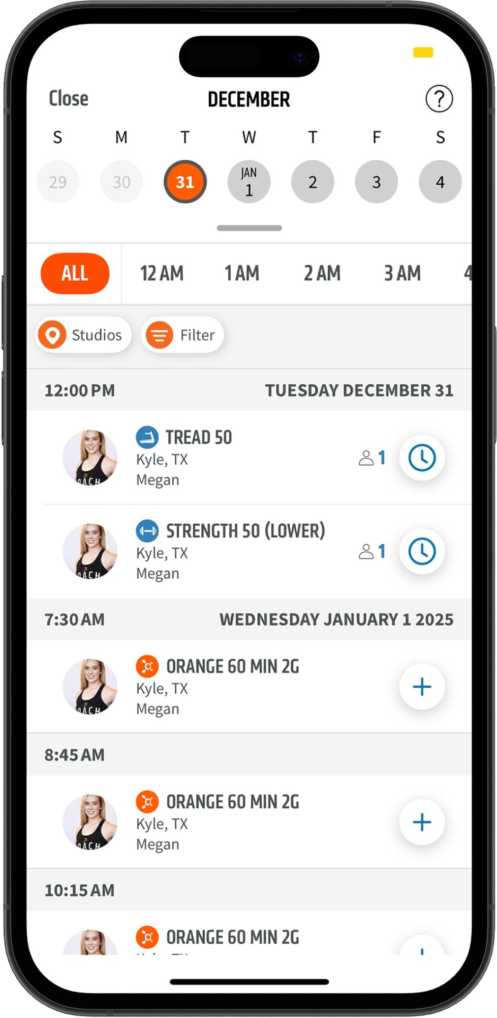
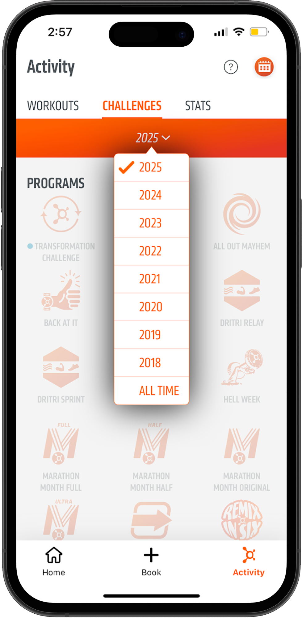
Orangetheory screenshots of existing features

Iterations before prototype testing
It was crucial to maintain a consistent UI with existing features while creating the hi-fi designs. To achieve this, I frequently referred to screenshots of the app to ensure consistency.

Originally, the 'Choose a Challenge' page was designed as a modal, but this led to excessive back-and-forth navigation when users explored different challenges and goals.
To improve usability, I transformed it into a dedicated page featuring a modal pop-up that displays the challenge or goal description along with a 'Start Challenge' button when users click on a challenge or goal icon.
Additionally, to enhance the challenge explanation modal, I added an icon to prevent it from feeling like a blank page.

On the Friends Feed page, I incorporated icons next to the stats to align with the existing UI style found elsewhere in the app.
Testing & Iterations
For hi-fi prototype testing, I conducted unmoderated tests with 6 participants across 3 tasks using Maze.
Task 1: Starting a challenge improved from an average rating of 4.5 to 5, as participants found the flow logical.
Task 2: Adding a new friend saw a significant jump in rating from 3.8 to 5, with users appreciating the intuitive UI.
Task 3: Checking a friend's class schedule rating went from 3.8 to 4.2, though two participants initially missed the dropdown menu. Since most users found this task easy, no changes were made.
Iterations

Users noted that the 'Next' button on the challenge page should be more prominent for better usability.
On the "Choosing Friends to Challenge" page, I updated the header from "Add Friends" to "Choose Friends" based on feedback from a group critique, where some users found the original wording slightly confusing.
On the "Find Friends" page, I repositioned the "Suggested" and "Contacts" buttons closer together to visually indicate their relationship, enhancing clarity and user experience.
Final Designs
The final screens for the task flow of starting a group challenge with a friend turned out excellent.
This feature is particularly significant for our users, as it not only enhances their experience but also encourages them to attend more classes. Now, users can initiate challenges and set goals with their friends, making workouts more enjoyable.
These are the final screens for the task flows related to adding a new friend and checking a friend's class schedules. These task flows are essential based on insights gathered from our initial user interviews.
Many users expressed a desire to join friends in classes and highlighted the difficulties they face with scheduling. This new feature simplifies that process. Users can now easily view the classes their friends are enrolled in and seamlessly join them.
What I Learned
By utilizing existing UI components in the app, you can assemble new interface elements modularly when adding additional features. This method ensures both visual and functional consistency across the product while efficiently accommodating new design requirements.
I realized how important it is to test early in the design process. Making significant changes during the low-fidelity stage allowed me to iterate quickly and avoid expensive revisions later on. This approach ultimately saved time and resulted in more confident final designs.
Next Steps
Moving forward, I would collaborate with the marketing team to create a targeted promotional strategy for the new friends feature to ensure a successful launch. Post-launch, it will be important to monitor user engagement closely and gather feedback to inform future updates and improvements. By analyzing usage data, I can continuously refine the feature to better meet user needs. Additionally, I would conduct a thorough review of the entire app to address UI inconsistencies identified during the development process, such as spacing issues on the challenges page.
Future enhancements could include adding a feature that allows users to upload a selfie with their completed workout posts and tag friends, as well as introducing rewards for completing goals and challenges. Another enhancement includes allowing users to filter through the available challenges and goals, enabling users to easily find activities that match their specific interests.