Mosing Motorcars
A luxury automotive service that offers secure, high-end vehicle storage, while also specializing in the sale and consignment of luxury and vintage cars.
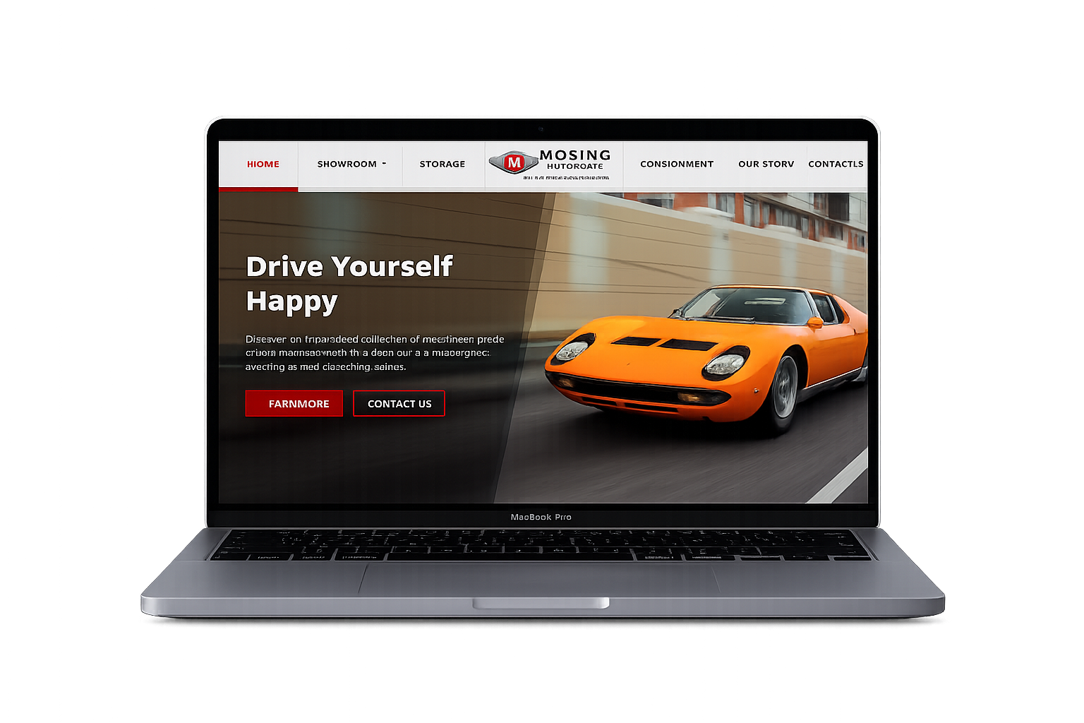
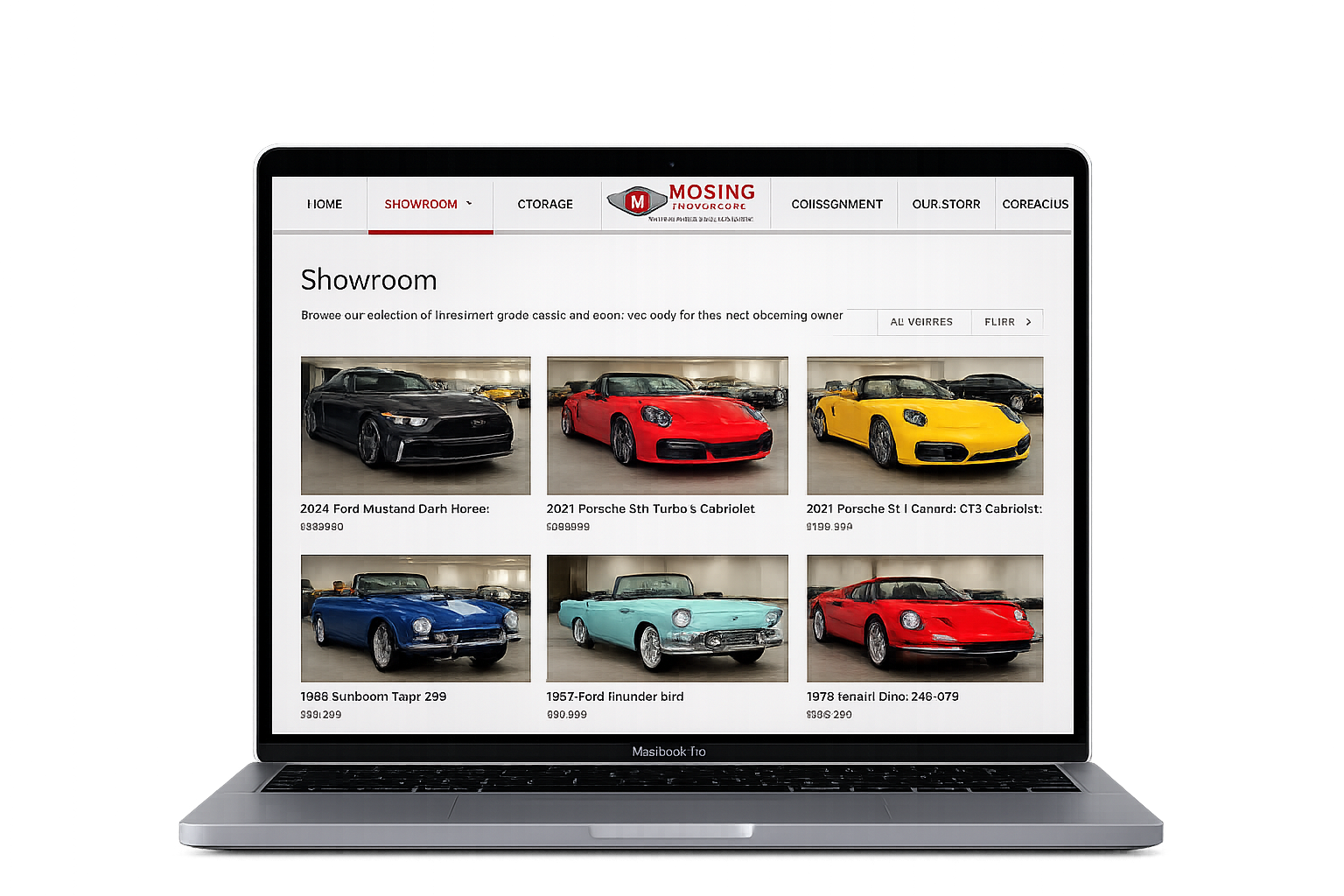
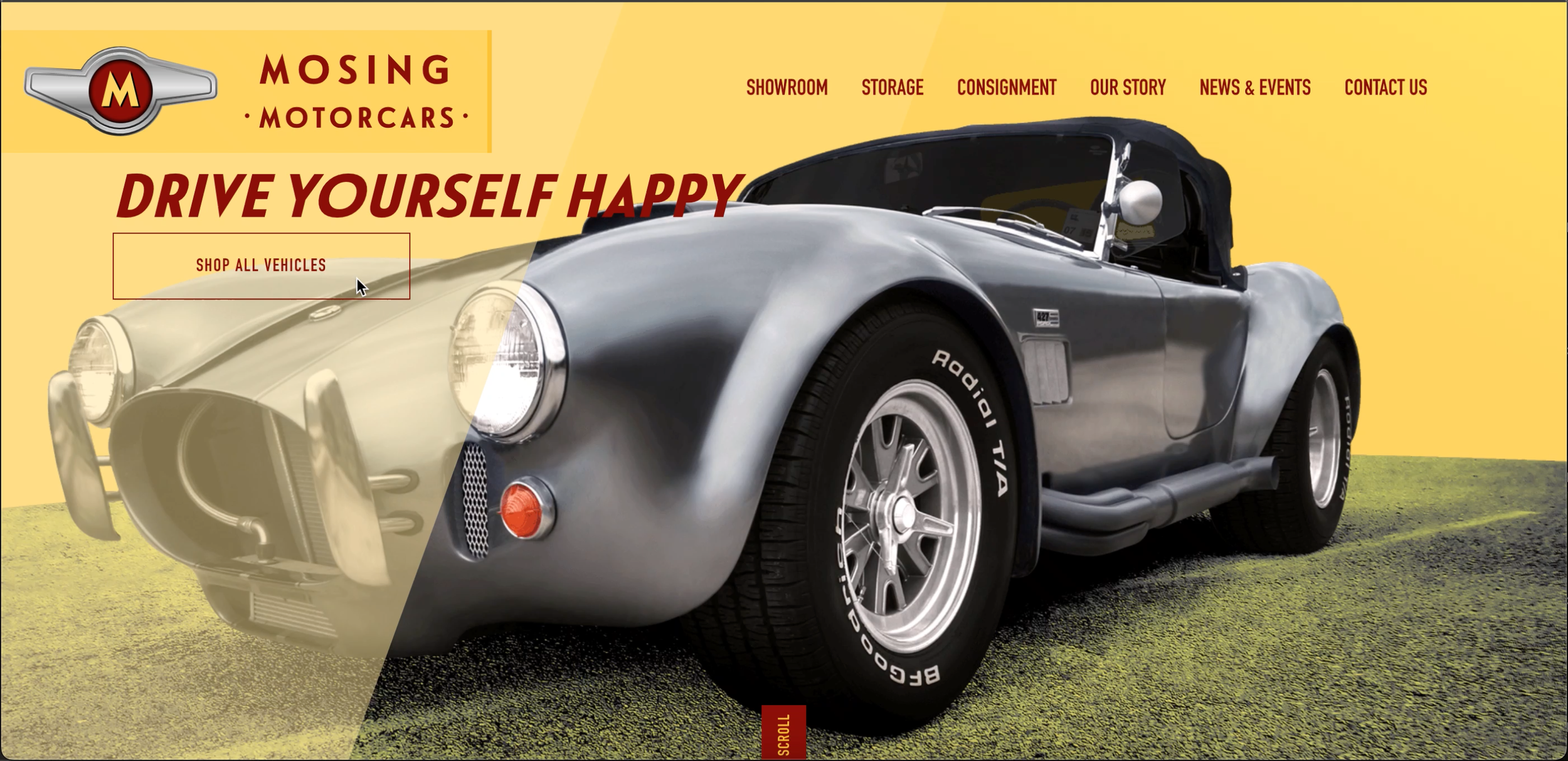
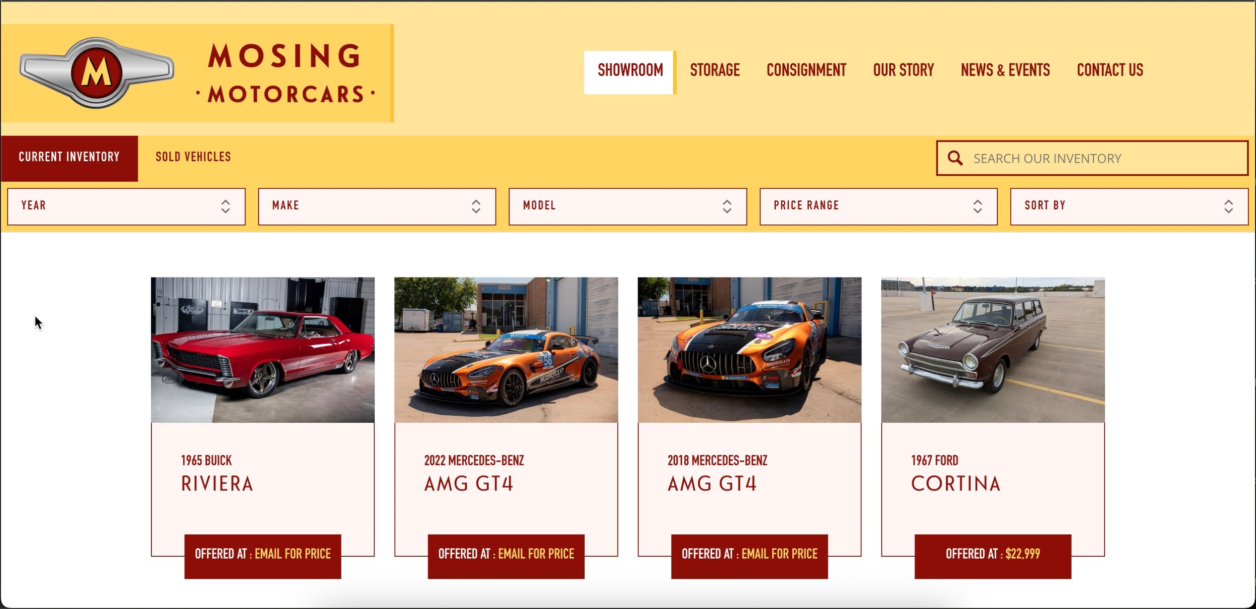
Final Design
Challenge
The original website failed to highlight car storage services and had an outdated design. Its unclear calls to action and disorganized layout resulted in a confusing user experience, as shown in the screenshots.
Role
UX Researcher, UX/UI Designer
Tools
Figma, Whimsical, Loom, Maze
Solution
A modern, refined redesign that puts vehicle storage front and center, supported by clear calls-to-action and an intuitive layout.
Original Design
Defining Goals & Vision
To ensure the redesign aligned with both the business objectives and the owner's vision, I initiated a discovery conversation early in the process. I prepared a targeted list of questions that helped guide our discussion around brand identity, user pain points, and functionality needs.
This conversation was crucial for aligning expectations and establishing a clear foundation for the design direction. Here’s what I learned:


Outdated Frustrating to navigate
Pain Points
Focus
Vehicle storage services


Sophisticated, secure, exclusive
Mood
Motto
“Drive Yourself Happy”

Primary Colors: Burgundy & Black
Secondary Color: Yellow
Brand Colors
Requested Additions:
Email subscription functionality for users
Integration of recent Instagram and Facebook posts
Research
Competitive Analysis
I conducted a competitive analysis to evaluate how luxury car services structure their websites. This analysis focused on key features, strengths, usability gaps, and identified opportunities to differentiate Mosing Motorcars through design and functionality. Additionally, I thoroughly reviewed the existing Mosing Motorcars website to pinpoint specific pain points and areas that could be improved.


Site being redesigned

Car details clearly displayed
Contact forms easily accessible
Informative "Our Story" page
No storage facility photos
All caps text reduces readability
Missing staff photos
Forms inconsistently placed
Empty News & Events page

Team bios with photos
Storage page shows facility
“Get in Touch” CTA on pages
Oversized header blocks content
No cars listed for sale
No sale alerts available
Contact page lacks clarity

Storage overview on homepage
Transparent pricing displayed upfront
Overwhelming dropdown menu options
No view all option for motorcycle listings
Contact form hard to find

Services clearly outlined
Membership pricing clearly listed
Showroom gallery for preview
Minimal About Us content
Gallery images too small
Only past events listed
No event alert signup
Design Phase
Low-Fidelity Wireframes
The insights gained during the research phase formed the basis for my design decisions, ensuring that the final product was not only visually enhanced but also strategically aligned with the brand and its users.
By beginning with low-fidelity sketches, I was able to explore a variety of ideas and then refine them while developing the wireframes used for my first prototype.
low-fi design
During the low-fidelity phase, I shared multiple design variations with the owner to gather feedback and ensure the visual direction aligned with their expectations.
Outcome & Impact
The project concluded earlier than planned due to business changes beyond my control. However, before we could conduct usability testing and make further iterations, the mid-fidelity designs I created were adopted as the foundation for the live site. This decision reflects the clarity and strength of the UX direction I provided.
By establishing a thoughtful structure, intuitive layout, and strategic content prioritization early in the process, I contributed to creating a more cohesive, user-focused experience for both vehicle storage and consignment services.
This project reinforced the value of thorough early research and strategic design: even without formal testing, a well-crafted mid-fidelity prototype can effectively guide development and enhance how users interact with a brand’s digital presence.